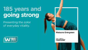
Watsons, the flagship health and beauty brand of AS Watson, today announced the launch of Watsons Evergreen, as part of AS Watson’s 185th anniversary celebrations. To elevate its significance and create a consistent and credible expression across markets, Watsons partnered with the Pantone Color Institute™, the world’s leading authority on colour. Combining Watsons’ rich heritage with Pantone’s expertise, the collaboration helped define and articulate a global brand asset that captures the essence of Watsons and its vision for the future.
Watsons Evergreen is a vibrant blue-green hue that symbolises everyday vitality, care and reassurance, reflecting Watsons’ purpose of helping customers LOOK GOOD, DO GOOD, FEEL GREAT every day. As a distinctive visual identity, it creates a shared language that connects Watsons markets worldwide.
From Watsons’ logo and store design to merchandising displays, digital channels and Own Brand products, Watsons Evergreen has long been a familiar presence across customer touchpoints. The Watsons Evergreen campaign will roll out across 16 markets, including Asia, Europe and the Middle-East, through a series of customer and community activations, as well as a curated range of products, reinforcing the brand’s long-standing connection with customers and communities around the world.